Why Windows “Metro” Design Language Won't Work
I just read a Microsoft design case study about translating an iPad application's interface paradigms to the new Metro style of Windows 8. If you're interested in the major user experience shifts coming to Windows in the very near future, I suggest you do too.

This article paints a very clear picture of what we are to expect from Microsoft interfaces going forward- and it isn't entirely positive.
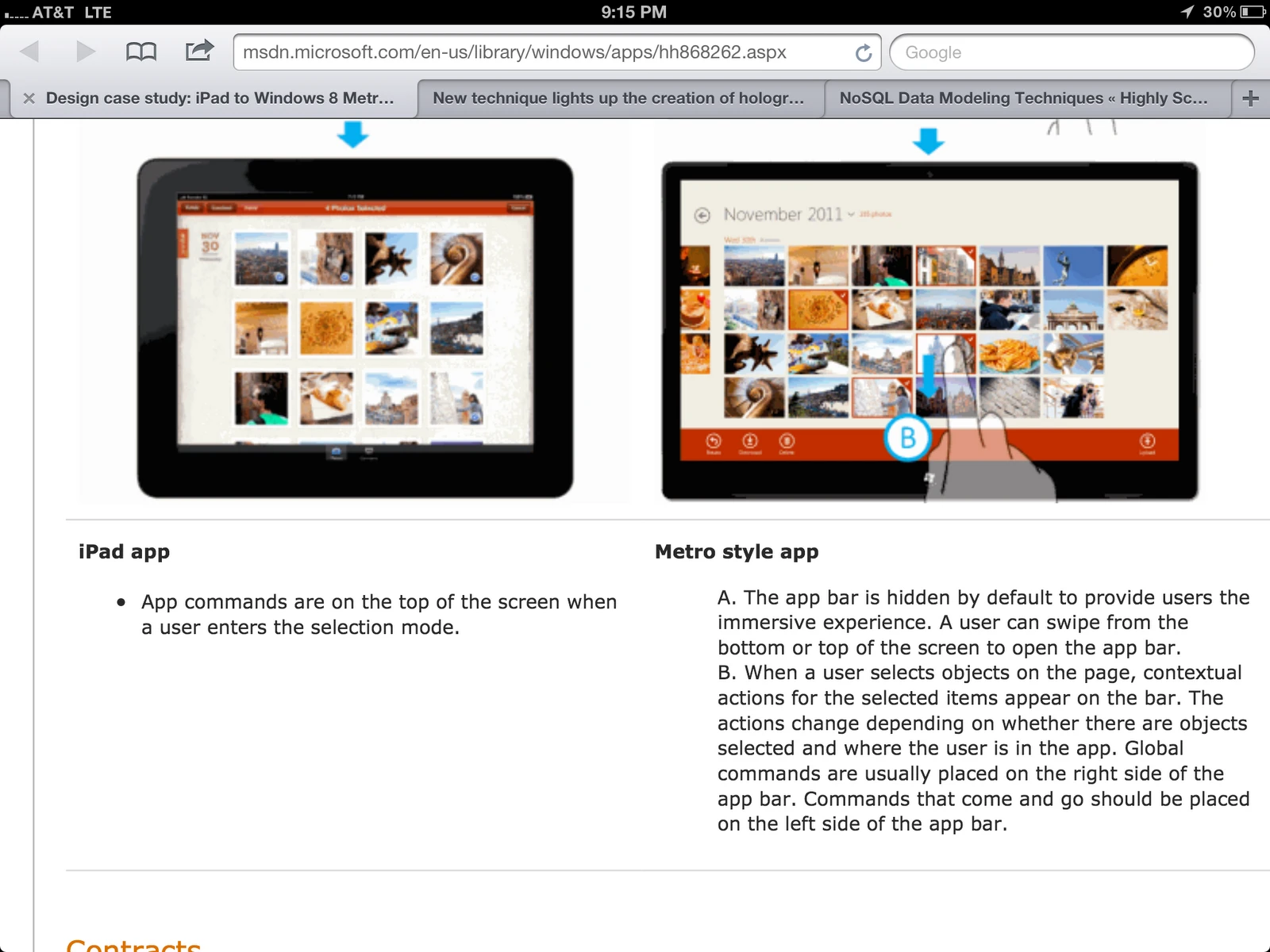
The root issue with Metro is that it relies too heavily on pre-existing knowledge of user interaction. In the side-by side examples, it's apparent how careful Apple is to always keep the most important functions of the application visible. That way, you can understand how to use one of their interfaces immediately upon seeing it. Sure, a chrome-less experience with no buttons and no descriptions at all whatsoever looks a little cleaner- but is inherently unintuitive because there is no visual indication of what you can do with it.
Unintuitive By Design
This is perfect exemplified by the case study segment about deleting a photo. On Microsoft's sample iPad UI, you can clearly see a button labeled “delete” which makes it very clear how to proceed with your desired action. On their example Metro application UI, there is no visual indicator whatsoever of how to delete something. In fact, they had to annotate the Metro application screenshot with a mock-up hand to describe how they want their application to be used. In that way, Microsoft's example Metro application exemplifies unintuitive design- someone with no previous experience would not know how to use it.
Third party developers have a choice- either adhere to the conventions set out by Microsoft, or bend the rules a bit so users can more easily understand how to perform tasks in their app. Give the choice I'd choose the latter- and if too many developers veer that way it'll lead to fragmentation across the ecosystem. In the above example about the “delete” button it relies on users being able to assume something they can't see is there for core functionality in the app- but what if applications all use different conventions? How will users build that familiarity? Will Windows applications of the future once again require a user manual?
Intentionally Inextensible
If Metro design style catches on and third party developers all use the same methodology for similar tasks on Windows 8, users could grow acclimated to the style and start assuming how to do things. This is clearly Microsoft's intention. However, that won't be the case. Applications diverge from the design norms constantly- even on iOS. Some enjoy great success (Twitter for iPad) and some less so (Facebook for iPhone's use of popovers on phone-sized devices is particularly egregious .) In the end, entirely well-meaning designers and developers will take risks and deviate because it is our job to push the limits to make something intuitive and beautiful. This is a good thing!
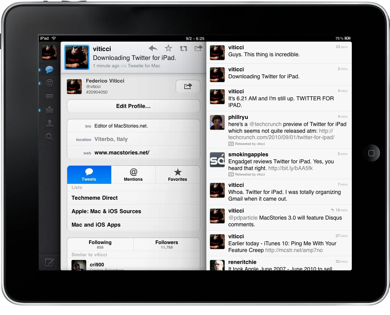
On iOS, the design paradigms allow for extension without breaking the overall user experience conventions. This is particularly true in Twitter for iPad. The genius of what Loren Brichter and team have accomplished there is that despite representing a serious departure from platform norms, there is no real design inconsistency with other applications. In fact, Twitter for iPad's tiles feel right at home on iOS. This is a consequence of how the iOS design principals are style and not just a theme. Even Apple's own applications (iPhoto, Pages, Keynote, Music, etc.) look radically different from each other, yet all fit in.
(Loren has brought many other gems to iOS application design as well, like pull-to-refresh and table cell swipe actions. But I digress.)
 Screenshot courtesy MacStories
Metro, on the other hand, is much more limiting. Instead of drawing out a canvas of conventions that developers can paint to their liking- it's much more prescriptive. At its core it is more of a theme than a design style. Consequently one cannot innovate beyond the styles Microsoft has already created without breaking at least some of the paradigms Metro is based on, which will result in inconsistency between third-party applications that have with no visual operation cues.
What's next for Windows?
This isn't to say Metro isn't a step in the right direction (a consistent design language of any kind is great) but Metro has a couple fatal flaws that will limit its adoption and longevity. By designing it both to be inherently unintuitive and hard to extend without breaking basic patterns, its use cases are quite limited. Some Metro apps will look great, but I would be surprised if this truly sticks as the new convention for the entire operating system. Microsoft has conflated good looking UI with great UX.
Consistency and simplicity are good things, but not at the cost of usability.